
Employer guideUpdated September 2026
Hiring Metrics Benchmarks: The Two We Measured, and the Four We Will Not Fake
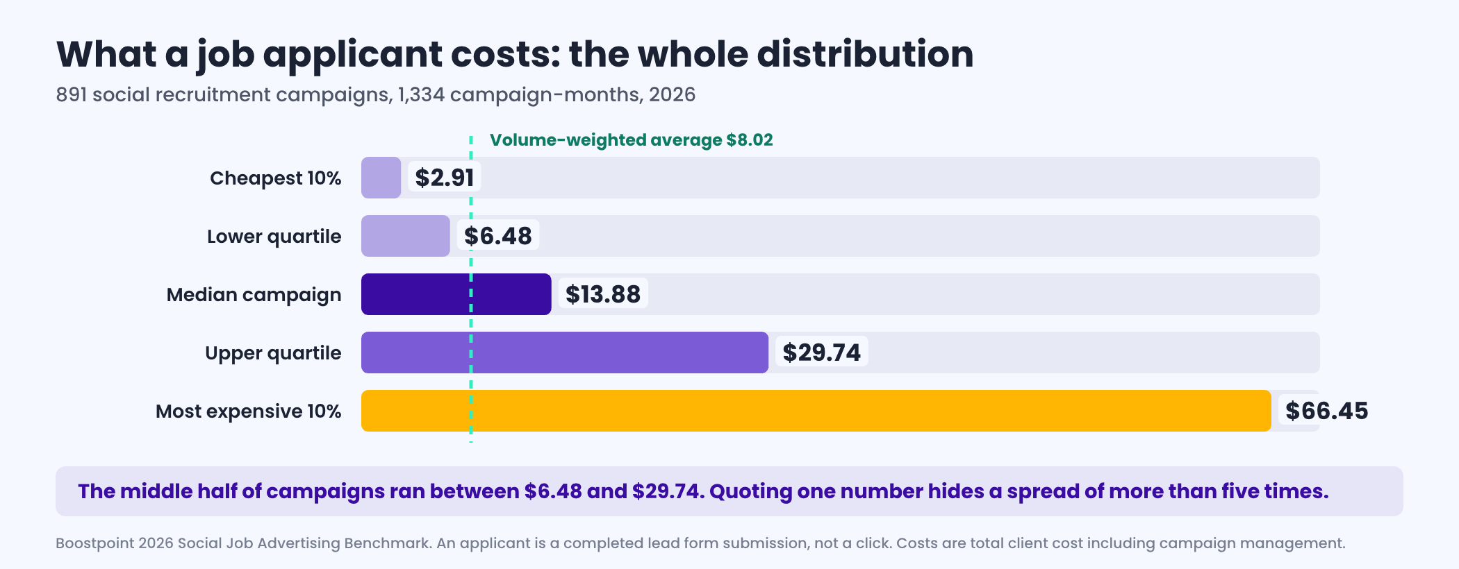
Across 891 campaigns and 1,334 campaign-months in 2026 the median campaign delivered an applicant for $13.88, the volume-weighted average was $8.02, and the middle half of campaigns ran between $6.48 and $29.74. The metric that explains the gap is not the ad auction. Application completion rate explains 70% of the variation between campaigns; what impressions cost explains 18%. Those two numbers we measured. Time to fill, cost per hire, quality of hire and offer acceptance rate we did not, because they live in your applicant tracking system and no advertising platform can see them.
Cost per applicant is a distribution, not a number
The single most common error in a job advertising budget review is quoting one figure. There are two defensible averages in this dataset and they are nearly double each other: the volume-weighted average of $8.02 and the median campaign at $13.88. Both are correct. The average is pulled down by a handful of very high-volume frontline roles that convert exceptionally well, so it is the right number for sizing an annual portfolio and the wrong number for budgeting one requisition.
The gap that matters is inside a single role
A quarter of campaigns delivered applicants under $6.48 and a quarter cost more than $29.74 — a spread of more than five times on the same platform, in the same period. Behavioral health and support professional campaigns ran from $18.36 to $334.56 between the quartiles, an eighteenfold spread inside one role family. When a band is that wide, role difficulty is not the explanation.
Cost per applicant by role family
Fifteen role families, with the median and the range the middle half of campaigns actually landed in. Read the range rather than the median; a single number invites the wrong argument with a finance team. Apply rate is the share of people who clicked and then completed the form, and it is the column that explains most of the rest of the table.
| Role family | Median | Middle 50% | Apply rate | Campaign-months |
|---|---|---|---|---|
| Customer service and admin | $2.71 | $2.14 to $7.47 | 25% | 24 |
| Caregiver and home care | $3.76 | $2.99 to $5.83 | 31% | 34 |
| CNA and nursing assistant | $7.72 | $6.18 to $12.06 | 18% | 32 |
| Warehouse and production | $9.83 | $3.15 to $18.72 | 20% | 82 |
| Sales | $11.61 | $5.99 to $21.17 | 21% | 100 |
| LPN and LVN | $12.77 | $7.53 to $21.46 | 21% | 57 |
| Technician and mechanic | $13.41 | $7.40 to $23.58 | 16% | 145 |
| Skilled trades | $14.14 | $7.58 to $21.49 | 15% | 35 |
| Management and professional | $16.87 | $4.62 to $60.11 | 16% | 50 |
| Registered nurse | $19.08 | $12.76 to $34.84 | 11% | 173 |
| CDL truck driver | $26.86 | $17.00 to $42.31 | 8% | 59 |
| Teacher and instructor | $30.95 | $16.60 to $56.74 | 8% | 15 |
| Allied health and imaging | $54.37 | $10.27 to $106.51 | 10% | 23 |
| Behavioral health and support professional | $55.55 | $18.36 to $334.56 | 9% | 19 |
| Therapy: PT, OT and SLP | $74.62 | $44.85 to $171.40 | 5% | 39 |
The pattern that runs down the table is not what most people expect. Expensive roles are not expensive because attention costs more. Driver campaigns bought impressions more cheaply than caregiver campaigns, at $17.88 per thousand against $27.88, and still cost roughly six times more per applicant. The whole difference is the apply rate: 8% of drivers who click finish a form, against 31% of caregivers. You are not paying for reach. You are paying for friction.
The benchmark that actually moves the number
We tested how much of the variation between campaigns each input explains on its own. Application completion rate explains 70%. Click-through rate explains 30%. What the auction charges per thousand impressions explains 18%. Nearly every hour a team spends negotiating media efficiency is aimed at the smallest of the three levers.
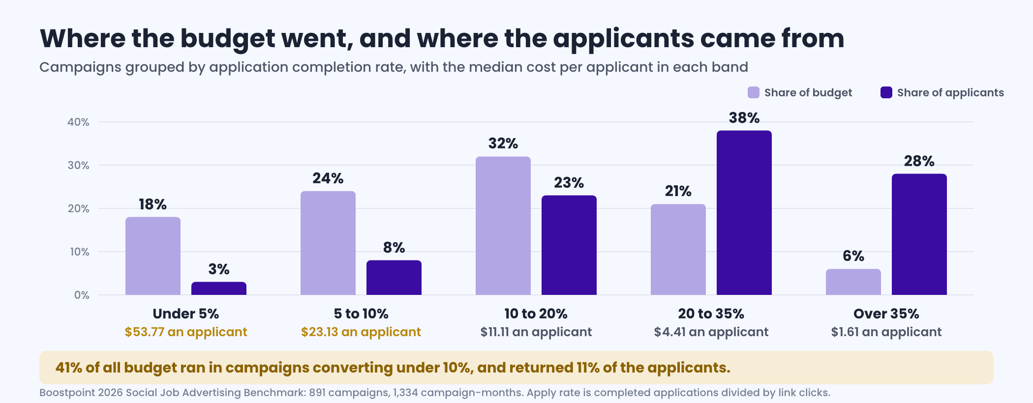
41% of all budget ran in campaigns where fewer than one in ten clickers finished the form, and those campaigns returned 11% of all applicants. Campaigns above 35% used 6% of budget to deliver 28% of applicants, at $1.61 each. That is a twelvefold cost difference between the bottom band and the 20 to 35% band, and it is mostly structural: whether the application stays on the platform, how many questions the form asks, and whether the screening removes people you could never hire or people you would have hired after a five-minute conversation.
A low apply rate is not automatically a failure
A campaign converting at 6% that hands recruiters licensed, pre-screened, ready-to-interview people may be a better use of budget than one converting at 35% that hands them a pile of forms to sort. What this data can show is the price of that choice, roughly twelve times the cost per applicant. What it cannot show is whether the quality gain was worth it. That number lives in your applicant tracking system, and it is the single most valuable thing most teams could start measuring this year.
Put your own quarter against the distribution
Recruitment KPIs: what each one is, and where its number actually lives
“Recruitment KPIs” and “talent acquisition metrics” are the same list under two vocabularies — the second is what large employers call it. What matters is not the naming but which system holds each number, because that determines whether you can trust it and whether anybody outside your business could benchmark it for you.
Metrics your advertising can see. Cost per applicant, application completion rate, impressions, frequency and cost per thousand. These are measured directly, which is why they are the ones published as distributions further up this page.
Metrics only your ATS can see. Applicants per hire, screening pass rate, interview-to-offer ratio, time to fill and time to hire. Nobody outside your business can measure these, and an external benchmark for them is somebody's survey rather than a measurement. Where those surveys do exist, we set them out with their sources on average cost per hire by industry.
Metrics only your HR system can see. Cost per hire, offer acceptance rate, quality of hire, ninety-day retention and first-year turnover.
Offer acceptance rate is the simplest of these and the most under-used. It is offers accepted divided by offers extended, over a period. A rate below about four in five is usually telling you one of three things — the pay in the advert did not match the pay in the offer, the process took long enough for a competing offer to land, or the job as described at interview was not the job as described in the offer letter. It is worth calculating monthly because it moves fast and it is the earliest signal that something upstream has broken.
Quality of hire is the metric everyone wants and almost nobody defines consistently. There is no single formula. In practice employers build it from some combination of performance rating at six or twelve months, retention past a threshold, hiring manager satisfaction, and time to full productivity — weighted and rolled into an index. Because the inputs are chosen by each employer, a published quality-of-hire benchmark compares nothing to nothing. The version that is useful is internal and relative: score your hires the same way every quarter and watch whether the number moves, by source, by role and by hiring manager.
That is the practical rule for this whole list. Advertising metrics are worth benchmarking externally because they are measured the same way everywhere. Everything downstream of the application is worth tracking rigorously and comparing only against your own last quarter.
Recruiting metrics to track: the formula and the benchmark for each
The section above sorts recruiting metrics by the system that holds them. This is the working list: twelve metrics a frontline employer can track every month, how to calculate each one, and the benchmark on this page to hold it against. Where the benchmark column says “your own last quarter,” that is deliberate; the number lives in your records and nobody outside can measure it for you.
| Metric | How to calculate it | Benchmark to compare against | Where the data lives |
|---|---|---|---|
| Cost per applicant | Total spend, divided by completed applications | Median $13.88; middle half $6.48 to $29.74; by role in the table above | Ad platform |
| Apply rate (application completion) | Completed applications divided by link clicks | Above 20% is strong; under 10% is a defect to investigate | Ad platform |
| Click-through rate | Link clicks divided by impressions | Fell from 1.69% to 0.94% as monthly frequency rose in the benchmark | Ad platform |
| Monthly frequency | Average times each person in the audience saw the ad in a month | Median cost per applicant $11.48 to $13.39 below 2.5; $18.76 above 3.0 | Ad platform |
| Applicants per hire | Completed applications divided by starts | Your own last quarter; 12 if you interview one applicant in three and hire one interviewee in four | ATS |
| Interview-to-hire ratio | Interviews held divided by hires | Around 3:1 to 5:1 when the phone screen is working (see the FAQ below) | ATS |
| Time to fill | Days from requisition approval to accepted offer | Your own last quarter, by role | ATS |
| Time to hire | Days from application to accepted offer | Your own last quarter; first contact within the hour is the lever | ATS |
| Offer acceptance rate | Offers accepted divided by offers extended | Below about four in five, check pay, speed and the offer wording | Offer records |
| Advertising cost per hire | Cost per applicant multiplied by applicants per hire | $138.80 at the $13.88 median and one hire per ten applicants | Ad platform and ATS |
| Source of hire | Hires from each channel divided by all hires | Your own last quarter; pair it with cost per applicant by channel | ATS |
| 90-day retention | Hires still employed on day 90 divided by hires in the cohort | Your own cohorts; see first 90 days turnover | HR system |
Two notes on using the list. Track the first four weekly per campaign, because they move within days and are the cheapest to fix; track the rest monthly by role and by source, because a single month of hires is too few to read. And put the market beside them: in the BLS JOLTS quits table, the July 2026 (preliminary) quits rate was 1.9% for all nonfarm employers and 3.4% in leisure and hospitality, so a hospitality operator with a quit rate near that level is running with the market, not behind it. The nine-column hiring tracker further down this page puts most of these into one sheet.
The four metrics we are not going to publish a number for
Search for hiring metrics benchmarks and you will find confident figures for time to fill, cost per hire, quality of hire and offer acceptance rate. Some come from employer surveys with a few hundred self-selected respondents. Some are extrapolations from advertising data. A submitted form is not a screened candidate, an interview or a hire, and no advertising platform can see what happened after your recruiter picked it up. So the honest table is the one that says which side of that line each metric falls on. If what you need is the cost of the days a seat stays open rather than a benchmark for them, that is the cost of vacancy calculator.
| Metric | Can we measure it? | Where the real number lives |
|---|---|---|
| Cost per applicant | Yes, directly | Advertising delivery. Published above as a distribution across 891 campaigns. |
| Application completion rate | Yes, directly | Advertising delivery. The single largest driver of cost, at 70% of the variation. |
| Cost per hire | No | Your applicant tracking system, combined with recruiter time and everything else that touches a requisition. Any benchmark deriving it from ad platform data is extrapolating. |
| Time to fill | No | Your requisition records. It depends on approval steps, interview scheduling and offer sign-off, none of which are visible to an advertising platform. |
| Quality of hire | No | Performance and retention data, six to twelve months after the hire. It is the most valuable hiring metric and the least commonly measured. |
| Offer acceptance rate | No | Your offer records. We can tell you what it cost to start the pipeline that produced the offer, and nothing beyond that. |
The one public benchmark you can check yourself
If you want a hiring benchmark that is neither ours nor a vendor survey, the Bureau of Labor Statistics publishes one every month and it is free. In July 2026 the national hires rate was 3.2% and the total separations rate was also 3.2%. That is the whole story of the hiring market in two numbers: at the national level, hiring is running at exactly replacement. The quits rate was 1.9% overall, 3.4% in leisure and hospitality and 3.1% in retail, which is why a frontline operator experiences a labor market that the headline figure describes as calm.
What that means for a hiring plan
A replacement-rate market means your requisition volume is set by your own separations before it is set by growth. The benchmark to hold yourself to is not somebody else's time to fill; it is whether the number of people leaving is a number you chose. We have written about the arithmetic of that in the turnover cost calculator, on employee turnover rates by industry, and on first 90 days turnover, which is where most frontline separations actually happen.
Frequency: the early warning nobody watches
Frequency is the average number of times each person in your targeted audience saw your ad in a month, and it is the most reliable leading indicator in the dataset. Below roughly 2.5 the median cost per applicant sits between $11.48 and $13.39. Above 3.0 it rises to $18.76, and above 4.0 to $26.78, while click-through rate falls from 1.69% to 0.94%. The audience has seen it and stopped responding. 33% of all budget in the study ran above a frequency of 3.0, which makes it the clearest single pool of recoverable money we found.
Find the leak in one campaign
What a normal campaign looks like, and what we still cannot tell you
Half of all campaign-months in the study ran on less than $334, returning a median of 20 applicants and reaching a median of 6,061 people. The upper quartile begins at $554 and the top decile at $988. If somebody has told you that social recruitment advertising needs a large committed budget before it works, that distribution is the counter-evidence, and it is drawn from delivery rather than from a pitch.
What we cannot tell you is the part that matters most to a hiring plan: what an applicant becomes. Applicants to screens to interviews to hires, by source, is the one series no advertising platform can produce, and without it every efficiency decision is made half-blind. If you change one thing this quarter, measure apply rate per campaign and treat anything under 10% as a defect to investigate rather than a cost to absorb. The full distribution, the methodology and a six-question worksheet are in our 2026 social job advertising benchmark.
These metrics are the measurement half of a plan. The annual document they feed — the demand forecast, the channel mix priced per applicant, and the owner against each line — is on talent acquisition strategy.
Application-to-interview and application-to-hire ratios
The application-to-interview ratio is completed applications divided by interviews held; the application-to-hire ratio is completed applications divided by starts. They are the two numbers that turn a cost per applicant into a budget, and like every metric after the application they live in your applicant tracking system, so we do not publish a benchmark for either. What we can show is how they work together.
- They chain. Application-to-hire is application-to-interview multiplied by interview-to-hire. If you interview one applicant in three and hire one interviewee in four, you need twelve applicants per hire. The interview-to-hire half usually sits around 3:1 to 5:1 when the phone screen is doing its job, as the FAQ below sets out.
- They set your advertising cost per hire. Divide your cost per applicant by your application-to-hire rate. At the $13.88 median from the 2026 benchmark and one hire per ten applicants, that is $138.80 of advertising per hire, before recruiter time or anything else.
- They move with speed, not only with quality. An application-to-interview ratio that gets worse usually means slow first contact or no-shows rather than weaker applicants, which is why the hiring tracker below counts applicants contacted within one hour and interviews attended.
Staffing KPIs: the metrics that tell you whether the schedule is covered
Recruiting metrics describe the pipeline. Staffing metrics describe the result on the floor: whether the shifts you scheduled were worked by people you employ, and at what cost. A frontline operation needs both, because a pipeline can look healthy while the schedule is held together by overtime and agency staff. These are the staffing KPIs worth a line on a monthly report, with the calculation for each.
| Staffing metric | How to calculate it | What a bad month is telling you |
|---|---|---|
| Vacancy rate | Open budgeted positions divided by total budgeted positions | Requisitions are opening faster than the pipeline fills them |
| Shift fill rate | Scheduled shifts worked by your own staff divided by shifts scheduled | Coverage is being bought, through overtime or agency hours, rather than staffed |
| Overtime share | Overtime hours divided by total hours worked | The team you have is absorbing the vacancies, which is usually where the next resignations come from |
| Agency or contract share | Agency hours divided by total hours worked | A permanent gap is being paid at a temporary price |
| Turnover rate | Separations in the period divided by average headcount | The requisition volume next quarter, before any growth |
| 90-day retention | Hires still employed on day 90 divided by hires in the cohort | Onboarding, the job preview in the ad, or one supervisor |
| Time to fill | Days from requisition approval to accepted offer | How long each vacancy costs you overtime before it closes |
Read them as a chain rather than seven separate numbers. Turnover sets the vacancies, time to fill sets how long each vacancy stays open, and shift fill rate and overtime share show what those open days cost. None of these has an external benchmark worth quoting at the level of your own operation; the national context is the BLS JOLTS hires, separations and quits rates in the public benchmark section above, and our employee turnover rates by industry page sets it out by sector. The one advertising number that feeds this chain is cost per applicant, because it prices how quickly you can refill a vacancy; the role-family ranges from the Boostpoint 2026 Social Job Advertising Benchmark are in the table at the top of this page.
Recruiting metrics examples: one sample month, worked through
The formulas above are easier to use once you have seen them run on one set of numbers. The month below is an illustrative sample, not a benchmark and not a real client: one role, one site, one month of advertising, with every metric calculated from the same seven inputs.
| Input | Sample value |
|---|---|
| Advertising spend | $1,388 |
| Link clicks | 500 |
| Completed applications | 100 |
| Interviews scheduled | 50 |
| Interviews attended | 40 |
| Offers made / accepted | 12 / 10 |
| Starts | 10 |
| Metric | Calculation | Result |
|---|---|---|
| Apply rate | 100 applications / 500 clicks | 20% |
| Cost per applicant | $1,388 / 100 applications | $13.88 |
| Applicant-to-interview ratio | 100 applications / 40 interviews attended | 2.5:1 (40% of applicants interviewed) |
| Attendance rate | 40 attended / 50 scheduled | 80% |
| Interview-to-hire ratio | 40 interviews attended / 10 starts | 4:1 |
| Offer acceptance rate | 10 accepted / 12 offers | 83% |
| Applicants per hire | 100 applications / 10 starts | 10 |
| Advertising cost per hire | $1,388 / 10 starts | $138.80 |
The sample was built so the cost per applicant lands on the $13.88 median campaign in the 2026 benchmark, which makes the last line match the $138.80 example earlier on this page. Swap in your own seven inputs and every row recalculates the same way. The point of working a sample through is the order it reveals: the apply rate and cost per applicant are set before anyone in your business touches a candidate, while every row from attendance onward is set by your own process, and only your applicant tracking system can tell you whether those rows are improving.
The interview-to-hire ratio in reverse: how many applicants you need each week
The ratios above are usually read forward, from applicants to hires. Run them backward and they become a weekly plan: start from the hires the schedule needs, divide back through the interview-to-hire ratio, the interview show rate and the share of applicants you book, and you get the number of applicants the advertising has to produce each week. The worked example below uses the same illustrative ratios as the sample month above, so it is a method, not a benchmark. For the planning question of how many people to interview per opening, see how many candidates to interview.
| Step | Illustrative ratio | Calculation | Result per week |
|---|---|---|---|
| Hires needed | Your target | Set by openings and turnover | 2 hires |
| Interviews attended | Interview-to-hire ratio 4:1 | 2 hires x 4 | 8 attended interviews |
| Interviews scheduled | Show rate 80% | 8 / 0.80 | 10 scheduled interviews |
| Applicants | Half of applicants booked | 10 / 0.50 | 20 applicants |
| Advertising | $13.88 per applicant | 20 x $13.88 | $277.60 |
The $13.88 is the median campaign in the Boostpoint 2026 Social Job Advertising Benchmark; replace it with your role family's figure from the table at the top of this page, and replace every ratio with your own from the last quarter. Two things fall out of doing it this way. First, the interview show rate is as powerful a lever as the budget: lift it from 80% to 100% in the example and the same two hires need 16 applicants instead of 20. Second, the weekly number is what a campaign should be judged against, because a campaign that produces 20 applicants in a week the plan needed 20 is working, whatever its cost per applicant looks like in isolation.
Interview show rate is the same measure as the attendance rate in the recruiting metrics table: interviews attended divided by interviews scheduled. The levers that move it are on the applicant's side of the calendar: booking the interview in the first conversation rather than by email days later, offering slots within a day or two, and a confirmation and reminder by text. Our interview scheduling guide covers the booking side, and the no call, no show policy page covers what to do when a new hire does not turn up on day one.
Frequently asked questions
A hiring tracker in nine columns
Most operations that ask for a hiring tracker are handed either an ATS report nobody reads or a spreadsheet with forty columns that stops being updated in week three. Nine columns is the version that survives, because every one of them is either a date somebody already knows or a number that changes a decision.
| Column | What goes in it | Why it is there |
|---|---|---|
| Role / site | Job title and location | Rolls up by role family, which is how cost actually varies |
| Opened | Date the vacancy existed, not the date it was approved | The gap between those two dates is usually the largest single delay in the process |
| Advertising started | Date the first ad ran | Separates “hard to fill” from “started late” |
| Applicants | Running count | The top of the funnel |
| Contacted within 1 hour | Count, not a percentage | The single most actionable number on the sheet |
| Interviews scheduled | Count | With the next column, gives you no-show rate |
| Interviews attended | Count | Cost per attended interview lives here |
| Offers made / accepted | Two counts | Offer acceptance, and a warning if it drops |
| Started | Date | The only outcome that counts, and the anchor for time to fill |
Three ratios fall out of those nine columns without any further work, and between them they diagnose most hiring problems:
- Applicants per hire. Applicants divided by starts. This is the number that drives every budget on a hiring plan, and most employers are guessing at it.
- Attendance rate. Interviews attended divided by interviews scheduled. If this is below about two-thirds, the problem is not your applicant volume and no amount of extra advertising will fix it.
- Interview-to-hire ratio. Interviews attended divided by hires. Read it alongside the attendance rate, because the two fail for opposite reasons.
On that last one: the interview-to-hire ratio is a screening measure, not a market measure. A ratio of 2:1 means almost everyone you interview is hireable, which usually means you are screening hard on the phone — efficient, unless you are also screening out people who would have worked. A ratio of 8:1 means the interview is doing the screening the phone should have done, which is expensive in manager hours and in candidate goodwill. Somewhere around 3:1 to 5:1 is where most frontline operations sit when the phone screen is doing its job, and if yours is far outside that, the fix is in the screening stage rather than in the advertising.
Keep the tracker at one row per vacancy and update it weekly. The temptation is to add columns for source, referral, recruiter and reason-for-decline; resist it until the nine are being filled in reliably, because a tracker that is 60% complete tells you less than one with fewer columns and no gaps.
What is quality of hire, and how do you measure it?
It is an index an employer builds rather than a standard metric, which is why there is no meaningful external benchmark for it. Most versions combine some of: performance rating at six or twelve months, retention past a threshold, hiring manager satisfaction, and time to full productivity. Because each employer picks the inputs and the weights, comparing your figure to a published one compares nothing to nothing. Measure it internally, keep the definition fixed, and watch it move by source, by role and by hiring manager.
What is a good offer acceptance rate?
Offers accepted divided by offers extended, over a period. We are not going to publish a benchmark figure for it, because it lives in your HR system and nobody outside your business can measure it. What is useful is the diagnosis: a rate that drops usually means the pay in the advert did not match the pay in the offer, the process ran long enough for a competing offer to arrive, or the job described at interview was not the job in the offer letter. Calculate it monthly - it moves quickly and it is the earliest signal that something upstream has broken.
What is a good cost per applicant for job advertising?
It depends almost entirely on the role. Across 891 campaigns in 2026 the median was $13.88, but customer service ran $2.71 and licensed therapy roles ran $74.62. A more useful test than any single benchmark is whether you sit inside the middle-50% band for your own role family, which is published in the table above. A figure quoted without a role attached is not a benchmark, it is a number.
What is a good application completion rate?
Above 20% is strong and under 10% indicates a problem worth investigating. In this study 41% of all budget ran in campaigns converting under 10%, and those campaigns returned just 11% of all applicants at $53.77 and $23.13 each. Campaigns above 35% used 6% of budget to deliver 28% of applicants at $1.61. Completion rate explains 70% of the variation in cost between campaigns.
What is the average cost per hire?
We do not publish one, and we would treat any figure drawn from advertising data with suspicion. Cost per hire includes recruiter time, agency fees, referral bonuses, assessments and everything else that touches a requisition, and it depends on how many applicants convert to hires inside your own process. Advertising data can show what it costs to generate an application. What happens after that lives in your applicant tracking system.
What is a good time to fill?
Also not something we can measure. Time to fill is set by approval steps, interview scheduling, offer sign-off and background checks as much as by candidate flow, and none of those are visible to an advertising platform. The published benchmarks for it come from employer surveys with self-selected respondents, which is worth knowing before quoting one in a board pack. Measure your own and compare it to your own last quarter.
Why is the average cost per applicant lower than the median?
Because the average is weighted by volume and volume concentrates in high-throughput frontline roles like caregiver and warehouse that convert at exceptional rates. Those campaigns pull the average down to $8.02 while the median campaign sits at $13.88. Use the volume-weighted average for portfolio-level forecasting across many requisitions, and the median when budgeting a single one or judging whether a campaign is performing.
What is the national hiring rate right now?
In July 2026 the Bureau of Labor Statistics reported a hires rate of 3.2% and a total separations rate of 3.2%, which means national hiring is running at replacement. The quits rate was 1.9% overall, 3.4% in leisure and hospitality and 3.1% in retail. This is the one hiring benchmark that is public, monthly and free to check, and it is a better reference point than most vendor surveys.
How much budget does social recruitment advertising need?
Less than most people assume. Half of all campaign-months in the study ran on under $334 and returned a median of 20 applicants each. The upper quartile begins at $554 and the top decile at $988. The more useful budget question is not how much but how it is spread: a daily spend large enough to saturate a narrow audience within days is what drives frequency above 3.0, where cost per applicant roughly doubles.
Which hiring metrics should a frontline employer actually track?
Four, and only one of them is a cost. Application completion rate per campaign, because it explains most of the cost difference. Monthly ad frequency, because it is the earliest warning that a campaign is decaying. Cost per applicant by role rather than blended, because a blended figure hides the roles that are failing. And applicants to hires by source, which no platform can give you and which makes every other number interpretable.
How do you calculate cost per hire?
The standard defined by SHRM and ANSI divides the sum of external recruiting costs and internal recruiting costs by the total number of hires made in the same period. External costs include advertising, agency fees, job boards, events and background screening; internal costs include recruiter and hiring manager time, referral bonuses and relocation. We do not publish a cost per hire figure. What we measure is cost per applicant and the share of clicks that become completed applications, and turning the first into the second requires your own applicant to hire ratio, which is a number only your applicant tracking system holds.
What are the most important hiring KPIs?
Six carry almost all the decision value: cost per applicant, apply rate, time from application to first human contact, frequency, source of hire and early attrition. The distinguishing feature of a useful hiring KPI is that a number moving changes what you do next; anything you report but would not act on is a statistic rather than a KPI, and the section above says where each one’s number actually lives.
What is a good interview-to-offer ratio?
We do not publish a benchmark for it, because the ratio is set by how tightly you screen before the interview rather than by anything about your market. A low ratio can mean excellent screening or a desperate hiring manager, and a high one can mean rigorous standards or a job nobody wants; without knowing which, the number tells you nothing. Track your own over three or four requisitions and use the direction of travel, not the level.
How do you measure quality of hire?
Honestly, most published quality-of-hire figures are performance ratings renamed. The only version that survives contact with frontline hiring is early attrition: the share of hires still employed at ninety days, split by source and by supervisor. It is unglamorous, it is already in your payroll data, and unlike a composite score it points at something you can change.
Which recruitment KPIs should a frontline employer track?
Four: applicants per hire by role family, apply rate, hours from application to first contact, and 90-day retention by supervisor and shift. A metric that would not change a decision does not belong on the list.
What is a recruitment KPI?
A hiring measure someone is accountable for, as distinct from a number that is merely reported. The test is whether anybody would do something differently next month because of it.
What should a hiring tracker include?
Nine columns: role and site; the date the vacancy existed; the date advertising started; applicants; applicants contacted within one hour; interviews scheduled; interviews attended; offers made and accepted; and the start date. Those nine produce applicants per hire, attendance rate and the interview-to-hire ratio without any extra work, and they are few enough that the sheet still gets updated in week ten.
What is a good interview-to-hire ratio?
Most frontline operations sit somewhere around 3:1 to 5:1 when the phone screen is doing its job. It is a screening measure rather than a market measure: near 2:1 usually means you are screening hard on the phone, which is efficient unless it is also removing people who would have worked, and 8:1 or worse means the interview is doing work the phone screen should have done, at a cost in manager hours.
What is the difference between the interview-to-hire ratio and the attendance rate?
They fail for opposite reasons, which is why they are read together. The attendance rate — interviews attended over interviews scheduled — tells you whether the people you booked turned up; below about two-thirds, more advertising will not help. The interview-to-hire ratio tells you how well your screening predicted who was hireable. A good attendance rate with a poor ratio is a screening problem, not a sourcing one.
What is a good applicant-to-interview ratio?
There is no external benchmark worth quoting, because the ratio is set by your own screening and speed rather than by the market. Calculate it as completed applications divided by interviews held: 30 applicants and 10 interviews is 3:1. Read the direction rather than the level. A ratio that worsens usually means slow first contact or interview no-shows, not weaker applicants, so check how many applicants were contacted within an hour and how many booked interviews were attended before spending more on advertising. Multiply it by your interview-to-hire ratio to get applicants per hire.
How do you calculate the interview-to-hire ratio?
Divide interviews attended by hires over the same period: 12 interviews and 3 hires is 4:1. Count attended interviews rather than scheduled ones, or no-shows will be mistaken for screening failures. Most frontline operations sit around 3:1 to 5:1 when the phone screen is doing its job, as set out above, and multiplying this ratio by the applicant-to-interview ratio gives the applicants you need per hire.
What recruitment metrics should you track, and how often?
The twelve in the recruiting metrics table above, on two clocks. Weekly, per campaign: cost per applicant, apply rate, click-through rate and monthly ad frequency, because they move within days and are the cheapest to fix. Monthly, by role and by source: applicants per hire, interview-to-hire ratio, time to fill, time to hire, offer acceptance rate, advertising cost per hire, source of hire and 90-day retention. Hold the first group against the 2026 benchmark (median $13.88 per applicant; an apply rate under 10% is a defect to investigate) and the second against your own last quarter. Our time to fill guide covers that one in detail.
What are staffing KPIs?
Staffing KPIs measure whether the positions and shifts you need are covered by your own employees: vacancy rate, shift fill rate, overtime share, agency or contract share, turnover rate, 90-day retention and time to fill. Recruiting metrics measure the pipeline that feeds them. The staffing KPIs table above gives the calculation for each.
What are some examples of recruiting metrics?
Cost per applicant, apply rate, applicant-to-interview ratio, interview attendance rate, interview-to-hire ratio, offer acceptance rate, applicants per hire, time to fill and 90-day retention. The sample month above runs each one on the same numbers: 100 applications from $1,388 of spend is $13.88 per applicant, and 10 starts makes applicants per hire 10 and advertising cost per hire $138.80.
What percentage of applicants get an interview?
There is no external measurement we would stand behind, because it is set by your own screening and how fast you make first contact rather than by the market. Calculate it as interviews held divided by completed applications. In the illustrative sample month on this page, 40 interviews from 100 applications is 40%; if you interview one applicant in three, it is about a third. Track whether yours is moving, not how it compares with someone else's.
Which recruiting benchmarks can you trust?
Three kinds. Advertising benchmarks measured directly from delivery, such as the Boostpoint 2026 Social Job Advertising Benchmark (891 campaigns, median $13.88 per applicant, middle half $6.48 to $29.74). Public labor market data such as the BLS JOLTS hires and quits rates. And your own last quarter, which is the only valid benchmark for anything after the application. Survey benchmarks for time to fill or cost per hire are useful context, but they come from self-selected respondents; our time to fill guide explains why.
How do you benchmark a recruiter?
Against their own history and against colleagues working the same roles, not against an industry figure. The measures that are fair to a recruiter are the ones they control: hours from application to first contact, interview attendance rate for the interviews they booked, offer acceptance rate, and 90-day retention of their hires. Cost per applicant and apply rate belong to the advertising and the application form, so judge those separately.
What is a good interview show rate?
We do not publish an external benchmark for it, because it is set by your own process rather than the market: how quickly you book the interview after the application, how far out the slot is, and whether the applicant gets a reminder. Calculate it as interviews attended divided by interviews scheduled. As set out above, a rate below about two-thirds means the problem is not applicant volume, and more advertising will not fix it. The illustrative sample month on this page uses 80%.
How many applicants per week do you need?
Work backward from the hires you need. Multiply weekly hires by your interview-to-hire ratio to get attended interviews, divide by your interview show rate to get scheduled interviews, and divide by the share of applicants you book to get applicants. With the illustrative ratios on this page (4:1, 80% and one applicant in two booked), two hires a week needs 20 applicants a week. Use your own ratios from the last quarter; nobody outside your business can measure them.
Bring your last quarter. We will tell you where it sits.
Twenty minutes, your own spend and applicant counts, against the distribution on this page for the roles and markets you actually hire in. If your numbers are fine we will say so.
Book a Demo