
Turnover cost calculator: what frontline churn actually costs you in a year
Turnover cost is headcount × turnover rate × what one replacement costs. A 200-caregiver agency at 75.5% turnover loses 151 people a year; at the Center for American Progress's 16% of annual salary against the BLS median wage of $34,900, that is $5,584 a departure and $843,184 a year. Refilling all 151 roles through advertising costs under 2% of that.
A note on who's writing this
Boostpoint sells managed recruitment advertising, which is a conflict of interest on a page like this one. So it is worth saying what the arithmetic below does to our own pitch: it makes advertising look small. In every worked example here, running the ads costs a low single-digit percentage of the turnover creating the need for them. If your turnover is driven by pay, scheduling or a supervisor, no advertising optimization will move the number that matters.
Boostpoint also publishes no turnover data of its own. We measure advertising, not retention. Every turnover rate and replacement-cost figure below is third-party and named in-table; the only Boostpoint figures here are advertising costs. To see what a replacement costs to employ once hired, payroll taxes and benefits included, use the employee cost calculator.
The formula, and the two numbers people get wrong
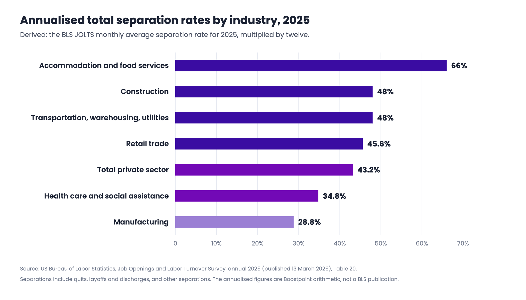
Turnover rate is separations divided by average headcount. The common mistake is comparing your figure to a published one measuring something else. The US Bureau of Labor Statistics reports separations as a monthly rate; the familiar "66% annual turnover" figure is that rate multiplied by twelve. It is a reasonable convention — the National Restaurant Association used it on JOLTS data — but it is a derivation, not a BLS publication, and is labeled as one here.
| Industry | BLS monthly average, 2025 | ×12 (derived) | Source |
|---|---|---|---|
| Accommodation and food services | 5.5% | 66% | JOLTS Table 20 |
| Construction | 4.0% | 48% | JOLTS Table 20 |
| Transportation, warehousing and utilities | 4.0% | 48% | JOLTS Table 20 |
| Retail trade | 3.8% | 45.6% | JOLTS Table 20 |
| Total private sector | 3.6% | 43.2% | JOLTS Table 20 |
| Health care and social assistance | 2.9% | 34.8% | JOLTS Table 20 |
| Manufacturing | 2.4% | 28.8% | JOLTS Table 20 |
Source: US Bureau of Labor Statistics, JOLTS, annual 2025 figures published 13 March 2026. Separations include quits, layoffs and discharges, and other separations. The derived column is our arithmetic.
Cost per departure is the number that gets invented. The most cited estimate is the Center for American Progress's: 16% of annual salary for jobs under $30,000, and 20% for jobs under $50,000. Worth knowing what sits underneath it — CAP synthesises 30 case studies published between 1992 and 2007. It is the standard citation because nothing better has replaced it for hourly work, not because it is recent.
Build your turnover cost stack
Pick the segment closest to your workforce and the calculator loads a published turnover rate and a BLS wage, both cited underneath. Overwrite anything you have a better number for — your own figures beat a national average every time. The slider sets what one departure costs as a share of annual pay.
Advertising figure uses Boostpoint's overall median of $13.88 per applicant across 891 campaigns. At the volume-weighted average of $8.02 the same refill costs $9,688.16. Cost per applicant is not cost per hire — the applicants-per-hire ratio above is yours, from your own ATS.
Segment presets carry their own sources; select one to see it. Default shown: home care caregivers.
What one departure is actually made of
A percentage of salary is a shortcut. Underneath it sits a list of real line items, and the most thorough published breakdown for hourly frontline work remains Dorie Seavey's 2004 study of long-term care turnover. Its dollar figures have aged; its categories have not.
| Category | What it contains | Source |
|---|---|---|
| Separation | Exit interviews and administrative processing, experience-rate increases in unemployment insurance, legal fees | Seavey 2004 |
| Vacancy | Additional overtime, use of temporary hires | Seavey 2004 |
| Replacement | Advertising, screening, interviewing, physicals and tests, background verification, certification, hiring bonuses | Seavey 2004 |
| Training and orientation | Classroom training and on-the-job training | Seavey 2004 |
| Increased worker injuries | Lost days and experience-rate increases in workers' compensation | Seavey 2004 |
Source: Dorie Seavey, The Cost of Frontline Turnover in Long-Term Care, Better Jobs Better Care, October 2004. Seavey also lists indirect costs — lost productivity, reduced service quality, lost clients, damaged morale — real but far harder to price. Cornell's Center for Hospitality Research concluded similarly in 2006: productivity loss from inexperience was the largest single contributor.
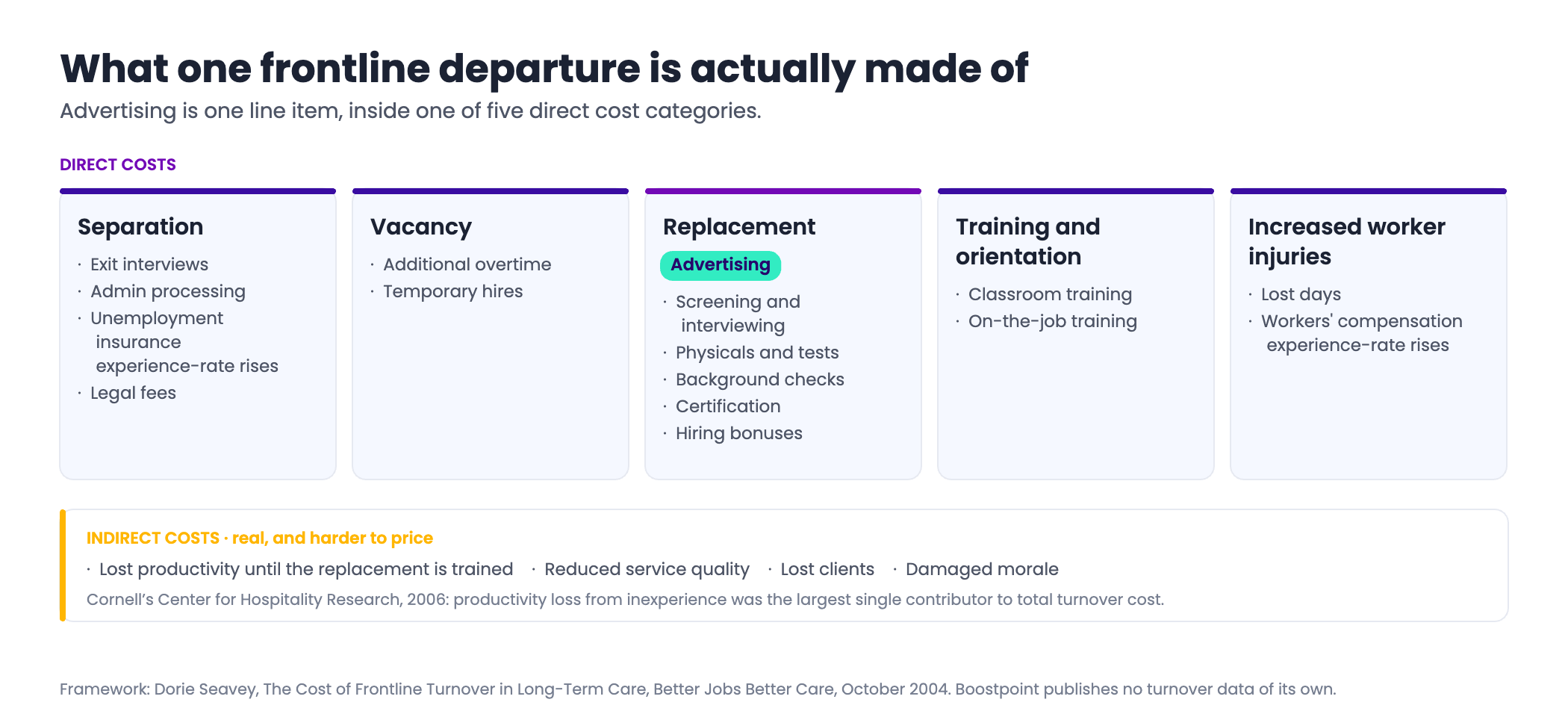
Notice where advertising sits: one item inside one of five direct categories, which together are generally the smaller half of the total once indirect costs are counted. That is this page's argument in a sentence, and not one in our favor.
Published turnover rates disagree, and the reason matters
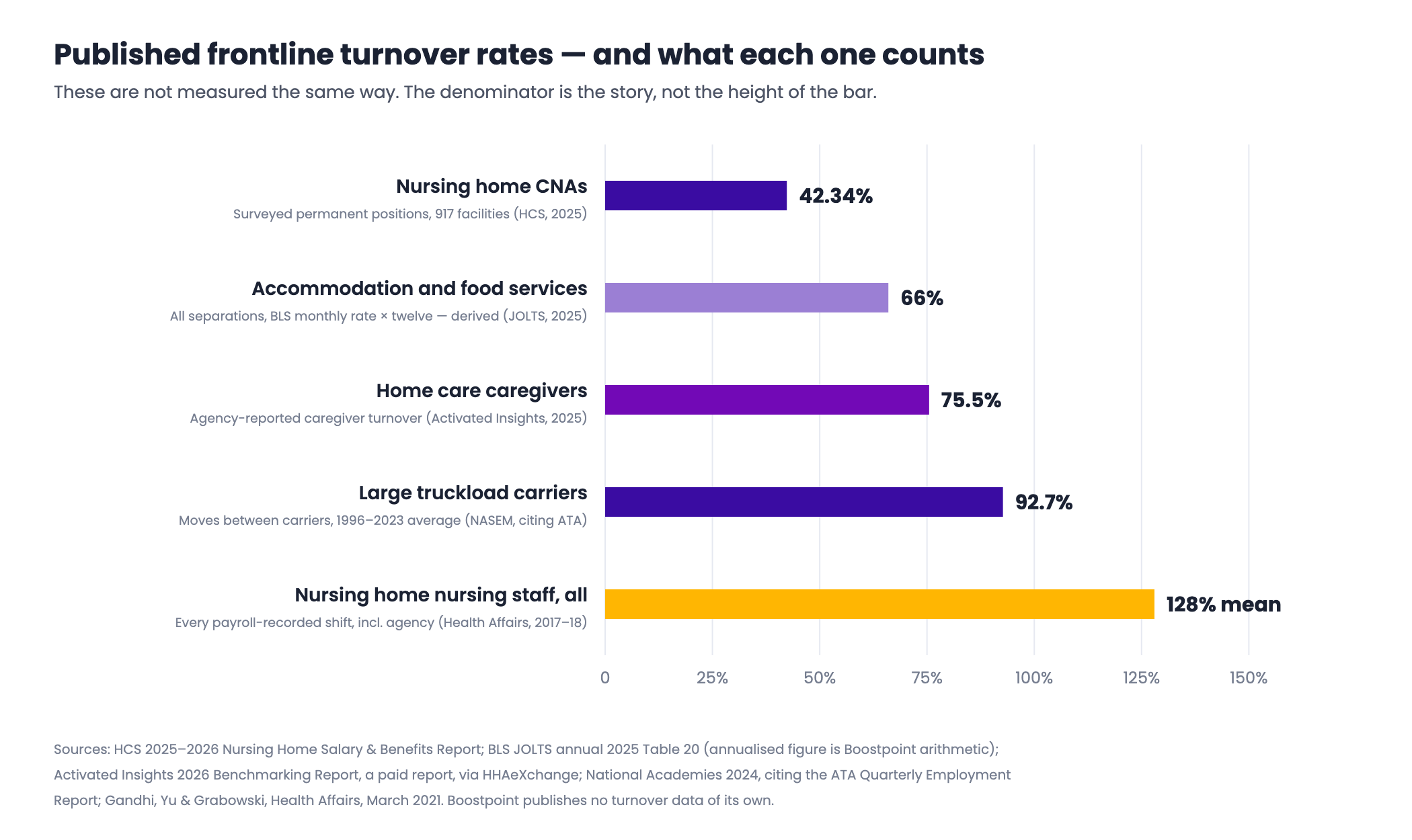
Two credible sources can report nursing home turnover as 42% and as 128% in the same decade without either being wrong. They count different populations. The federal series is the one place the definitions are held constant, and the industry-by-industry rates are worth reading before you trust any single figure quoted at you. Before spending anything, it is also worth checking which half of your own separations is even reachable, which is where employee retention strategies starts.
| Segment | Rate | What it counts | Source |
|---|---|---|---|
| Nursing home CNAs | 42.34% | Surveyed permanent positions, 917 facilities, 2025 | HCS 2025-2026 Nursing Home Salary & Benefits Report |
| Nursing home nursing staff, all | 128% mean / 94% median | All payroll-recorded nursing staff including agency and PRN, CMS Payroll-Based Journal, 2017-2018 | Gandhi, Yu & Grabowski, Health Affairs, March 2021 |
| Home care caregivers | 75.5% | Agency-reported caregiver turnover, 2025 | Activated Insights 2026 Benchmarking Report (paid; figure via HHAeXchange) |
| Large truckload carriers | 92.7% | Annualised driver turnover 1996-2023; moves between carriers, not exits from driving | National Academies, 2024, citing ATA Quarterly Employment Report |
| Accommodation and food services | 66% (derived) | All separations, monthly BLS rate × twelve | BLS JOLTS Table 20, annual 2025 |
The 42.34% and 128% figures are not in conflict: the first counts surveyed permanent staff, the second every payroll-recorded shift including agency cover. Setting them side by side without that caveat is the commonest error in this literature. Note also the American Trucking Associations' own position — it argues the 90%-plus figure measures churn between carriers, not exits from the industry.
The case for spending the money on retention instead
Run the arithmetic. 200 caregivers at 75.5% turnover is 151 departures a year. At CAP's 16% of a $34,900 median wage, each costs $5,584 — an annual bill of $843,184.
Now get very good at advertising and cut cost per applicant by a third: on this example it saves a few thousand dollars. Cut turnover from 75.5% to 65% instead — ten and a half points, a hard but ordinary result from fixing scheduling or a pay band — and that is 21 fewer departures, or $117,264. The retention lever is roughly twenty times the advertising lever.
So the honest recommendation, before ours: if you have not established why people leave, more advertising is premature. Most frontline exits cluster early, which is why first 90 days turnover has its own page and calculator. In home care, caregiver turnover covers what reduces it; for fleets, truck driver turnover costs and retention does the same. If the plan is agency staff instead, price it first — staffing agency markup decodes those invoices.
Where advertising does change the number
There is a narrower claim we will make, about volume rather than efficiency. Turnover sets a hiring requirement and someone has to fill it. The question is not whether advertising makes turnover cheaper — it does not — but what sourcing those 151 people costs.
Across 891 Boostpoint-managed campaigns the median cost per applicant is $13.88 and the volume-weighted average is $8.02. The gap is the story: the volume-weighted figure is dominated by large, well-tuned campaigns, so a typical campaign looks like the first number and a well-run one like the second. Take your ATS's applicants-per-hire ratio — say 8 — and refilling 151 roles needs 1,208 applicants: $16,767.04 at $13.88, or $9,688.16 at $8.02.
Set that against $843,184 of turnover cost and advertising is under 2% of it. Cost per applicant is not cost per hire — hires happen in your ATS, not the ad platform, and any vendor quoting a cost per hire from ad data is computing something it cannot see. What a posting returns is worked out at job board ROI; the dataset is at benchmarks.
What we won't tell you
- A cost-per-turnover figure for truck drivers, or a warehouse-specific turnover rate. The driver number still circulating is $8,234, from a study published in 2000; every warehouse source we found was vendor marketing or paywalled.
- The $5,864-per-restaurant-employee figure. Everywhere, attributed to Cornell, and untraceable to any Cornell publication. Every page carrying it is a vendor blog with no citation.
- A Boostpoint turnover benchmark, or a cost per hire from our data. We have neither. The only cost-per-hire figures here are SHRM's: $4,129 for fiscal 2015 and nearly $4,700 in 2022.
If advertising is 2% of what your turnover costs, then advertising is not your turnover problem — and the vendor telling you otherwise is selling the 2%.
What it costs to replace one employee
The calculator above works in a share of annual pay, because that is how the published research expresses it. Converted into dollars, here is what one departure costs at frontline wages, using the same three published shares.
| Wage | Annual pay at 2,080 hours | 16% of pay | 20% of pay | 33% of pay |
|---|---|---|---|---|
| $15.00 an hour | $31,200 | $4,992 | $6,240 | $10,296 |
| $18.00 an hour | $37,440 | $5,990 | $7,488 | $12,355 |
| $22.00 an hour | $45,760 | $7,322 | $9,152 | $15,101 |
| $25.00 an hour | $52,000 | $8,320 | $10,400 | $17,160 |
Two things to hold onto when you use a figure from that table. The first is that the shares were derived across mixed workforces, so applying the 33% figure to a role with a two-day training period will overstate the cost, and applying 16% to a licensed role with a six-week ramp will understate it. The second is that a replacement cost is not a cost per hire: it includes separation, vacancy, lost productivity and the injury and error rate of a new person, none of which appear in a recruiting budget. Cost per hire, for comparison, is a much smaller number covering only the search.
Hire new vs retain: the break-even
The question underneath "is it cheaper to retain or replace" has a precise answer, and it does not require any new research. If a retention measure would lower your annual turnover rate by a given number of percentage points, the most you can spend on it per employee per year and still break even is:
The break-even
Break-even retention spend per employee per year = (percentage points of turnover avoided ÷ 100) × the cost of one departure
Take a hundred warehouse associates at $18.00 an hour, where one departure costs 20% of annual pay, or $7,488. At 45% turnover you lose 45 people a year and $336,960. A shift-scheduling change, a referral program or a pay adjustment that takes turnover down to 35% saves ten departures and $74,880 a year — which means you could spend up to $748.80 per employee per year, or about $62 a month per person, and still be even. Most retention measures that actually work cost far less than that, which is why the arithmetic usually favors retention over recruiting.
Two conditions attach to that answer, and both are real. The measure has to move the rate: spending $748.80 a head on something that does not change why people leave costs you $74,880 and saves nothing. And the saving is only bankable if you do not backfill the avoided departures anyway — if headcount is growing, the recruiting cost stays and the retention saving shows up as capacity rather than as cash. Establish why people are leaving before you price the fix; on frontline work the answer is usually scheduling, the first ninety days, or a supervisor.
Frequently asked questions
How do you calculate the cost of employee turnover?
Multiply three numbers: how many people hold the role, what share leave in a year, and what one replacement costs. The third is the hard one. The standard shortcut is a share of annual pay — the Center for American Progress put it at 16% for jobs under $30,000.
What is the average cost of turnover for an hourly employee?
There is no single trustworthy average, which is why this page gives you a slider rather than a number. The anchors are CAP at 16% of annual salary and Work Institute at 33% of base pay — but Work Institute is a consultancy publishing its own research with no method shown, and CAP synthesises studies from 1992 to 2007.
What turnover rate is normal for frontline work?
It depends on the sector. Deriving annual rates from BLS JOLTS 2025 monthly averages gives roughly 66% for accommodation and food services, 48% for construction and for transportation and warehousing, 45.6% for retail, 34.8% for health care and 28.8% for manufacturing. Roles run higher: nursing home CNAs 42.34%, caregivers 75.5%, truckload carriers 92.7%.
Why do published turnover rates for the same industry disagree?
Because they count different populations. Nursing home turnover is reported at 42.34% by a survey of permanent positions at 917 facilities, and at a mean of 128% by a study of every payroll-recorded nursing shift including agency cover. Check whether a published rate counts the same people yours does.
Does the cost of turnover include recruitment advertising?
Yes, but a small part. Advertising is one line item inside the replacement category, one of five direct categories, and those are generally the cheaper half once lost productivity and service quality are counted. On the worked example here, refilling every departure comes to under 2% of the total.
How much does it cost to advertise the roles turnover creates?
Take your applicants-per-hire ratio from your own ATS and multiply. Across 891 Boostpoint-managed campaigns the median cost per applicant is $13.88 and the volume-weighted average $8.02. Refilling 151 roles at 8 applicants per hire needs 1,208 applicants: $16,767.04 at the median, $9,688.16 at the volume-weighted average.
Is cost per applicant the same as cost per hire?
No. Cost per applicant is not cost per hire. Cost per applicant is what the ad platform can see; hires are recorded in your applicant tracking system, which holds the only cost per hire that exists for your business. SHRM's $4,129 for fiscal 2015 and nearly $4,700 in 2022 are cost per hire, and not cost of turnover either.
Should we spend the money on retention or on recruiting?
Establish why people leave first. On the example here, cutting turnover from 75.5% to 65% saves $117,264 a year; getting materially better at advertising saves a few thousand. If exits cluster in the first three months, the fix is onboarding and scheduling.
How much does it cost to replace an employee?
Between 16% and 33% of the employee's annual pay in the published research: the Center for American Progress puts it at 16% of pay for jobs under $30,000 and 20% for jobs paying $30,000 to $50,000, and the Work Institute at 33% across roles. On an $18.00-an-hour job paying $37,440 a year that is $5,990 to $12,355 for one departure. The figure covers separation, vacancy, replacement, training and the higher error and injury rate of a new person.
What is turnover cost per employee?
Two different things get called that. Cost per departure is what one leaver costs you — 16% to 33% of that person's annual pay. Turnover cost per employee is the annual churn cost spread across your whole headcount: departures a year multiplied by the cost of one, divided by the number of people in the role. At 45% turnover on $18.00-an-hour roles costing 20% of pay to replace, that is about $3,370 a year for every person on the team, whether they leave or not.
Is it cheaper to retain an employee or hire a new one?
Almost always cheaper to retain, and the break-even tells you by how much. The most you can spend per employee per year and still come out even is the percentage points of turnover you would avoid, divided by 100, multiplied by the cost of one departure. Cutting turnover from 45% to 35% on a hundred $18.00-an-hour roles saves $74,880 a year, which funds $748.80 per person. The catch is that the spend has to actually change why people leave.
See what refilling your openings would actually cost
We will run your headcount, your turnover rate and your own applicants-per-hire ratio against the turnover bill the advertising sits inside — including the cases where the answer is that you do not need us yet.
Book a demoMethodology. Every turnover and replacement-cost figure is third-party and named in-table. Sources: BLS Job Openings and Labor Turnover Survey, annual 2025, published 13 March 2026 (annualised columns are our arithmetic — the monthly average × twelve — and labeled derived); BLS Occupational Employment and Wage Statistics via the Occupational Outlook Handbook, May 2024, for wages; Center for American Progress, November 2012, synthesising 30 case studies from 1992-2007; Work Institute for 33% of base pay, vendor research with no published method; Dorie Seavey, Better Jobs Better Care, October 2004, for the cost categories; HCS 2025-2026 Nursing Home Salary & Benefits Report; Gandhi, Yu and Grabowski, Health Affairs, March 2021; the Activated Insights 2026 Benchmarking Report, a paid report we could not read directly, reaching us via HHAeXchange, a home-care software vendor; National Academies 2024, citing the ATA Quarterly Employment Report; SHRM for cost per hire. Boostpoint publishes no turnover data of its own; its advertising figures come from 891 campaigns and 1,334 campaign-months and are what advertisers paid. Cost per applicant is not cost per hire. This is a sample of Boostpoint campaigns, not an industry-wide study. Worked example in full: 200 people; 75.5% turnover, so 151 departures; $34,900 average annual wage; 16% of wage per departure, so $5,584 each and $843,184 a year; 8 applicants per hire, so 1,208 applicants, costing $16,767.04 at $13.88 and $9,688.16 at $8.02. The retention comparison holds headcount at 200 and drops turnover to 65%: 21 fewer departures, $117,264. Re-verify wage, turnover and compliance figures quarterly. Dataset at benchmarks.